Graphics can make or break a PowerPoint presentation. Well-designed graphics grab attention, convey key information visually, and make your presentation more memorable. Follow these tips to create stunning graphics that make your PowerPoint stand out.
Keep it Simple
Overly complex graphics risk confusing your audience. Prioritize simplicity in your graphics by:
- Only including essential elements that support your key message
- Using minimal text and focusing more on visuals
- Avoiding overwhelming your slides with too many graphics
Remember, simple doesn’t mean boring. A clean, uncluttered graphic connects better with audiences.
Use High-Quality Images
Low-resolution, pixelated images look unprofessional and detract from your presentation. When selecting images:
- Source them from reputable stock sites like Unsplash and Pexels
- Use images with resolutions of at least 1024×768 pixels
- Crop images cleanly and remove any unnecessary background elements
High-quality relevant images make your graphics more visually compelling.
Utilize Contrasting Colors
Leverage the power of color contrast to make key elements stand out. Some tips:
- Use bold, contrasting colors for graphics against a neutral background
- Emphasize headings and data labels with bright colors that contrast against the graphic’s main hue
- Avoid red/green color combos as 10% of men have red-green color blindness
Strategic use of color contrast focuses the audience’s attention.
Maintain Consistency
A consistent design system strengthens your brand identity and visual coherence.
- Use the same fonts, color schemes, graphic styles across all slides
- Create custom graphics templates for consistency
- Reuse successful graphic layouts and styles
Consistent graphics help audiences instantly recognize your brand.
Animate Thoughtfully
Subtle animations can spotlight important data insights and transition between ideas. But overdoing animations causes distraction.
- Use minimal movement and transitions
- Animate only if it serves a clear purpose
- Apply movement only to elements needing emphasis
Seamless, subtle animations enhance graphics without overwhelming.
Balance Information Density
Data-rich graphics risk cognitive overload if not carefully balanced. Follow these tips:
- Chunk dense graphics into digestible sections
- Use white space, dividers and borders to visually separate elements
- Alternate dense graphics with simpler slides giving audiences breathing room
Strategic information density keeps audiences engaged as you walk them through complex ideas.
Direct Focus
Well-placed graphic elements can draw audiences to key takeaways.
- Use arrows, circles, boxes to highlight critical data points, trends and conclusions
- Align graphics to the bottom right as people naturally look there first
- Make pointer lines thicker than regular graphic lines
Draw attention to the most impactful data insights.
Choose Charts Wisely
Choosing the right chart type enhances data visualization and insights.
- Use bar charts to compare metrics across categories
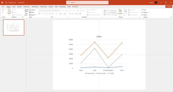
- Show trends over time through line and area charts
- Represent part-to-whole relationships with pie charts
- Spot correlations via scatter plots
Matching chart type to data insights prevents misrepresentation.
Check Accessibility
Ensure your graphics work for audiences with visual impairments by:
- Using sufficient color contrast levels
- Including descriptive alt text for images
- Avoiding transmitting key information only through color
- Enabling screen reader compatibility
Inclusive design expands your reach and impact.
Test for Understanding
Validate whether your graphics are conveying your intended messaging clearly.
- Get user feedback from a sample audience
- Identify areas of misinterpretation
- Refine graphics to resolve comprehension issues
User testing ensures graphics successfully communicate your ideas, insights and conclusions.
With strategic design choices and user-centric refinement, you can create PowerPoint graphics that capture attention and clearly convey impactful insights. What data story will your next presentation graphics tell?


