Inserting line charts in PowerPoint is a great way to visually represent data and trends. Line charts are particularly useful when you want to show how something changes over time or compare multiple sets of data.
One example of where this tutorial would be relevant is in business presentations where sales figures or market trends need to be communicated effectively. Let’s do it.
1. Go to the Insert tab and click the Chart button.

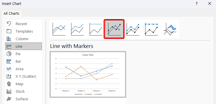
2. There are numerous different chart types, this depends on what type of chart you want to insert into your presentation. As an example, we want a line chart with markers.

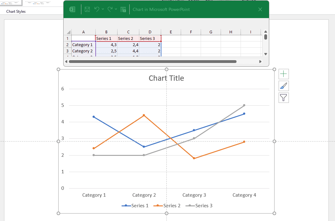
3. It is going to insert a basic line chart onto your slide and opens up a mini Excel window where you can modify the data so that it’s relevant to what you’re trying to display.

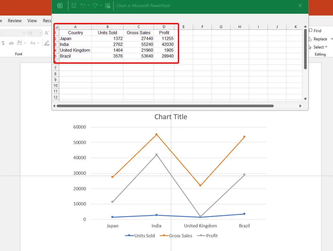
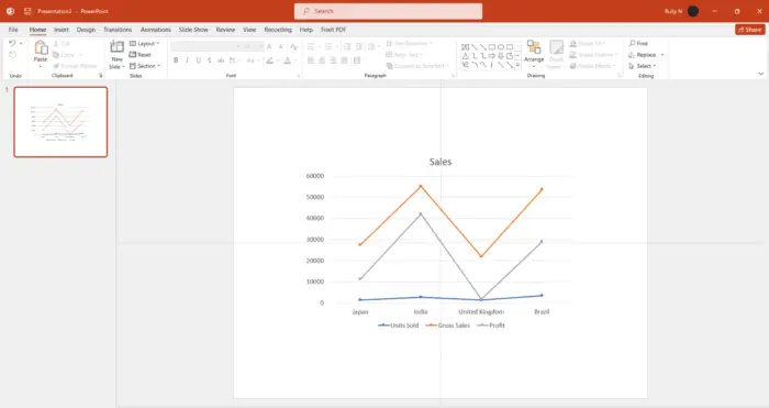
4. To modify the data, simply replace the values in this Excel spreadsheet and it’s going to update the chart. You could do this manually or if you have the data stored in an Excel spreadsheet, you can copy and paste it in. Once you’ve updated your figures, you can close down this Excel worksheet.

5. If you need to make changes to the existing figures, you can bring up that Excel pop-up window again. Just go up to the Chart Design and choose Edit data.

By using a well-designed line chart that highlights important information clearly and concisely, presenters can engage their audience while making complex data more digestible for everyone involved.


