Google Slides is a presentation maker app that lets you create and organize your presentation slides online. Furthermore, Google Slides has an easy-to-use interface and online sharing features, which are helpful for works that require a substantial amount of space, such as business and other activities.
For example, we need to prepare a presentation for a business portfolio. If you’re the CEO of a company and want to present your business portfolio, you must use presentation slides, right? So, in this case, what tool do you employ to present your income statement? It must be a chart, right?
A chart, commonly known as a graph, is a tool for displaying a snapshot of data as supplementary information in your presentation. To keep stuff relatively simple, here are some exceptional hints or instructions for all who are confused about creating a chart in Google Slides.
How to Create a Chart in Google Slides:
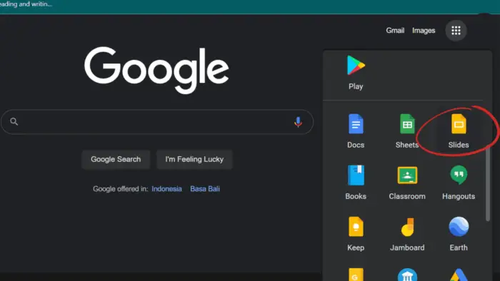
1. Launch Google and select ‘Google Apps‘. Look for the app ‘Slides‘.
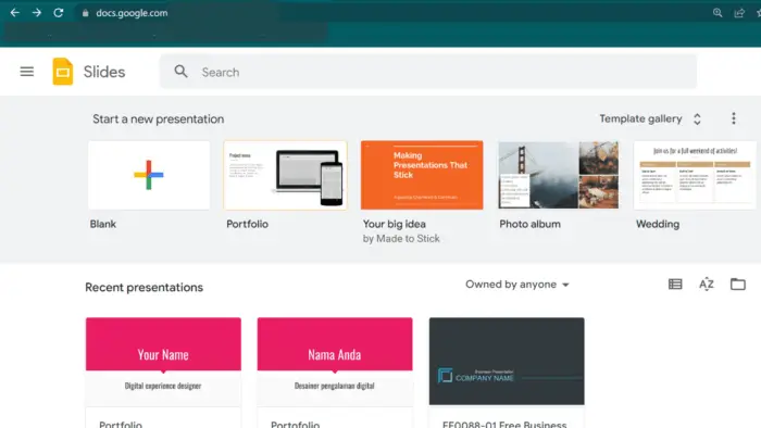
2. When you first enter Google Slides, choose one of the pre-made templates or a blank document.
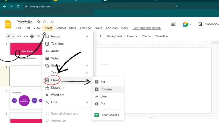
3. Following that, insert a chart or graph in Google Slides. Insert your chart in Slides by selecting Insert > Chart. You can insert any chart you want by following a few simple steps. Place the cursor on the slide where you want to insert the chart. Navigate to the insert menu, select the chart, and click it. A column chart will be displayed on your slides. Similar to the images, you can resize, position, and scale your chart.
4. Change the chart’s data from Google Slides to Google Sheets. Here are the steps to insert data you gathered in Google Sheets into Google Slides.
In Google Slides, the data included in the Chart comes from only placeholder data. Here, you need to update it according to your needs. Next, click on the Linked Chart icon at the top right corner of the chart. Then click ‘Open Source’ from the drop-down menu. During this step, you will be able to access Google Sheets.
Furthermore, you can customize the data in the embedded Google Sheets view to change the chart. This sheet allows you to customize headers, axis titles, and numeric data. The graph will automatically adjust by typing your new data over the old one.
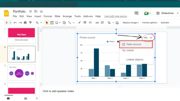
5. The chart will be displayed in Google Slides. Go back to Google Slides after updating all your data. You will be presented with a new data chart suitable for your specific data. If you need to make corrections, you can simply re-use the ‘Open Source‘ and adjust it accordingly. New data or deleted data will be immediately displayed in the chart.
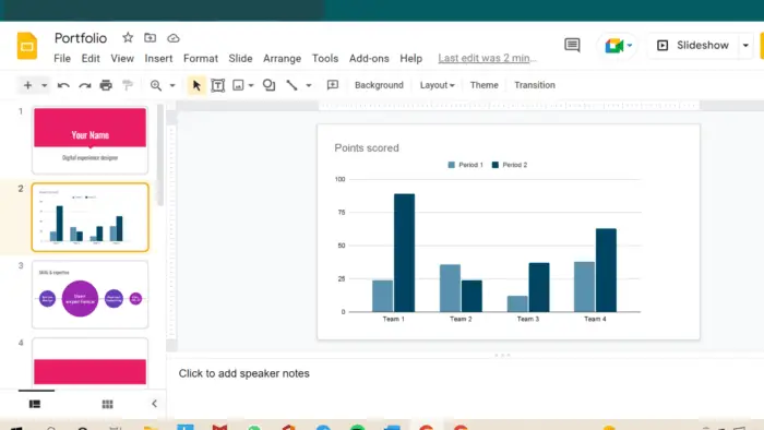
As you can see, simple charts are an attractive and subtle solution to convey your data. You can use the chart to support your presentation for those who should display the statistical data to clarify something. You can try this alternative since the charts are simple to create and modify in Google Slides.
