Creating impactful data visualizations in PowerPoint is a key skill for anyone preparing presentations, reports, or dashboards. Charts and graphs allow you to present complex data in a format that’s easier for audiences to digest and understand.
This comprehensive guide will teach you how to make polished, professional graphs and charts that bring your data to life in PowerPoint.
How to Insert Graphs in PowerPoint

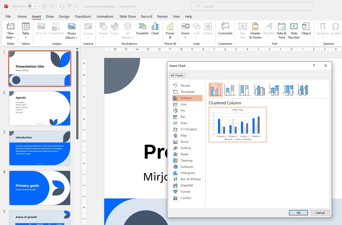
PowerPoint offers a quick and straightforward way to create various types of graphs like bar graphs, line graphs, pie charts etc. directly within the app. To insert a new graph:
- Click the Insert tab on the ribbon
- Click the Chart icon in the Illustrations group
- Select the desired graph type in the Insert Chart dialog box
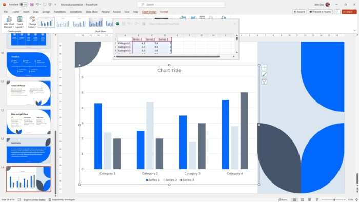
A graph placeholder will be inserted into the slide along with a linked Excel worksheet to input the chart data.Once the data is entered, the graph updates automatically. The Excel worksheet can be reopened anytime to modify the data.
Choosing the Right Graph Type
Picking the appropriate graph type based on the data is key for effective visualization. Here are some popular graph types and the data situations they are best suited for:
- Column charts – Comparing values across categories
- Bar graphs – Comparing categories across values
- Line graphs – Showing trends and changes over time
- Pie charts – Displaying part-to-whole relationships
- Scatter plots – Revealing correlations between two variables
- Area graphs – Emphasizing quantity over time
Spend time understanding your data and objectives before selecting a graph type. Excel can provide recommendations.
How to Add Styles to Graphs

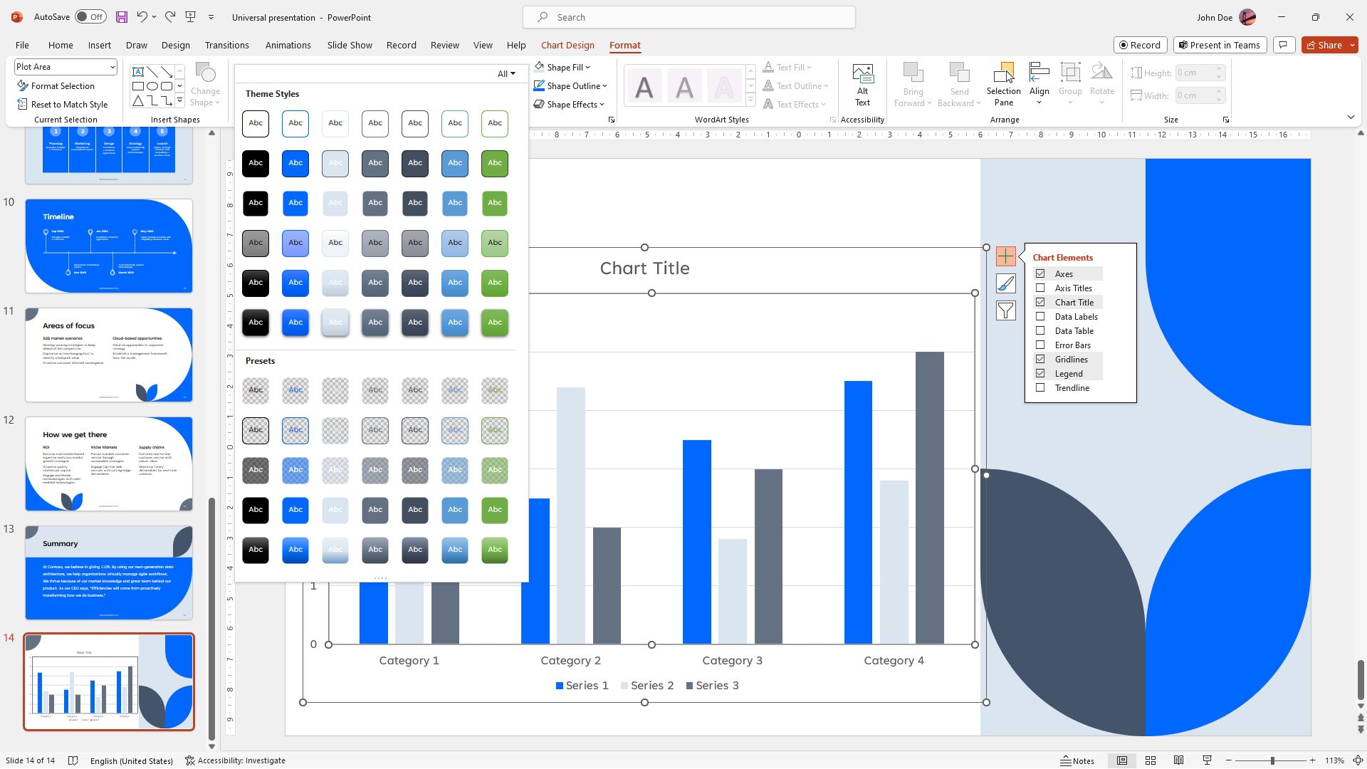
To give your graph a cohesive, professional look, apply styles and color themes that align with your presentation design.
Go to Chart Design > Chart Styles to select a predefined style. Match colors to your presentation theme.
For advanced formatting, manually change colors of individual elements like plot area fill, data markers, legend etc. on the Format tab.
Animating Graphs
Animations can be used to introduce graphs incrementally or highlight key data points. Some effective animations include:
- Having data series appear one by one
- Making pie slices expand out from the center
- Drawing attention to a trend line using Motion Paths
- Revealing a total value or average line at the end
Use animations judiciously. Excessive motion can be distracting.
FAQs
How do you make a graph look good in PowerPoint?
To make a graph look good in PowerPoint, format the chart to fit with the slide’s content and template’s overall color and font themes. Tone down the colors and use a monochrome chart for better readability. Remove unnecessary elements like chart borders, gridlines, and axes for a cleaner look.
How do I create an interactive chart in PowerPoint?
To create an interactive chart in PowerPoint, insert a static chart first, then add Action Buttons from the ‘Insert’ tab and ‘Shapes’ option. Right-click on the Action Button and select ‘Action Settings’. Set the action to ‘Hyperlink to’ and choose the slide you want the audience to go to when they click the Action Button.
How do I create a grid chart in PowerPoint?
To create a grid chart in PowerPoint, insert a table with the desired number of rows and columns. Adjust the cell size to create a square grid. You can do this by selecting all the cells, clicking the ‘Layout’ tab on the ribbon, and setting the desired cell size.
How do you plot a line graph in PowerPoint?
To plot a line graph in PowerPoint, click on the ‘Insert’ tab and select ‘Chart’. Choose the line chart type and double-click the chart you want. A spreadsheet will appear, where you can replace the default data with your own information. Close the spreadsheet, and the line graph will be plotted on your slide.


